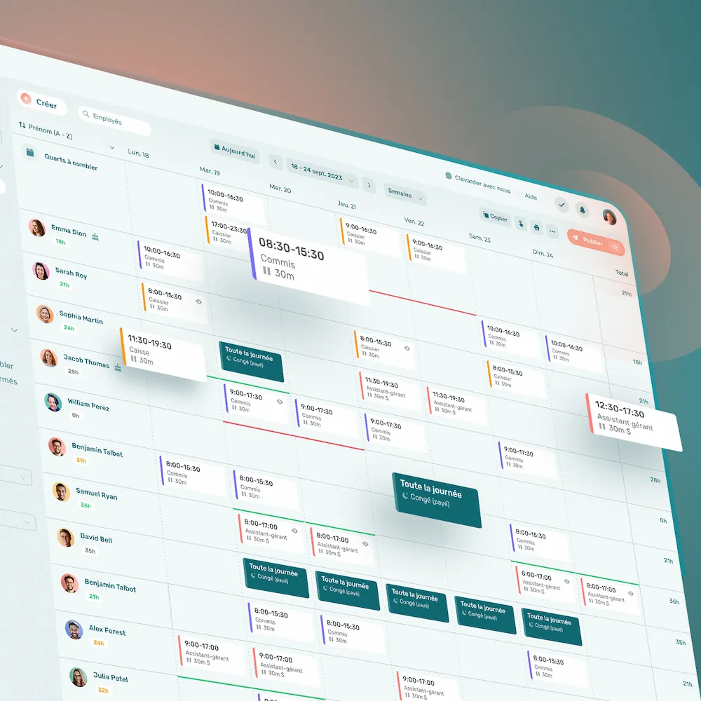
An updated scheduling interface and a better user experience.
Dear managers. We are proud to finally introduce our redesigned scheduling interface. Focused primarily on improving the general user experience, this redesign is the conclusion of several years of consideration and feedback. Here’s a preview of what to expect when you next log in.
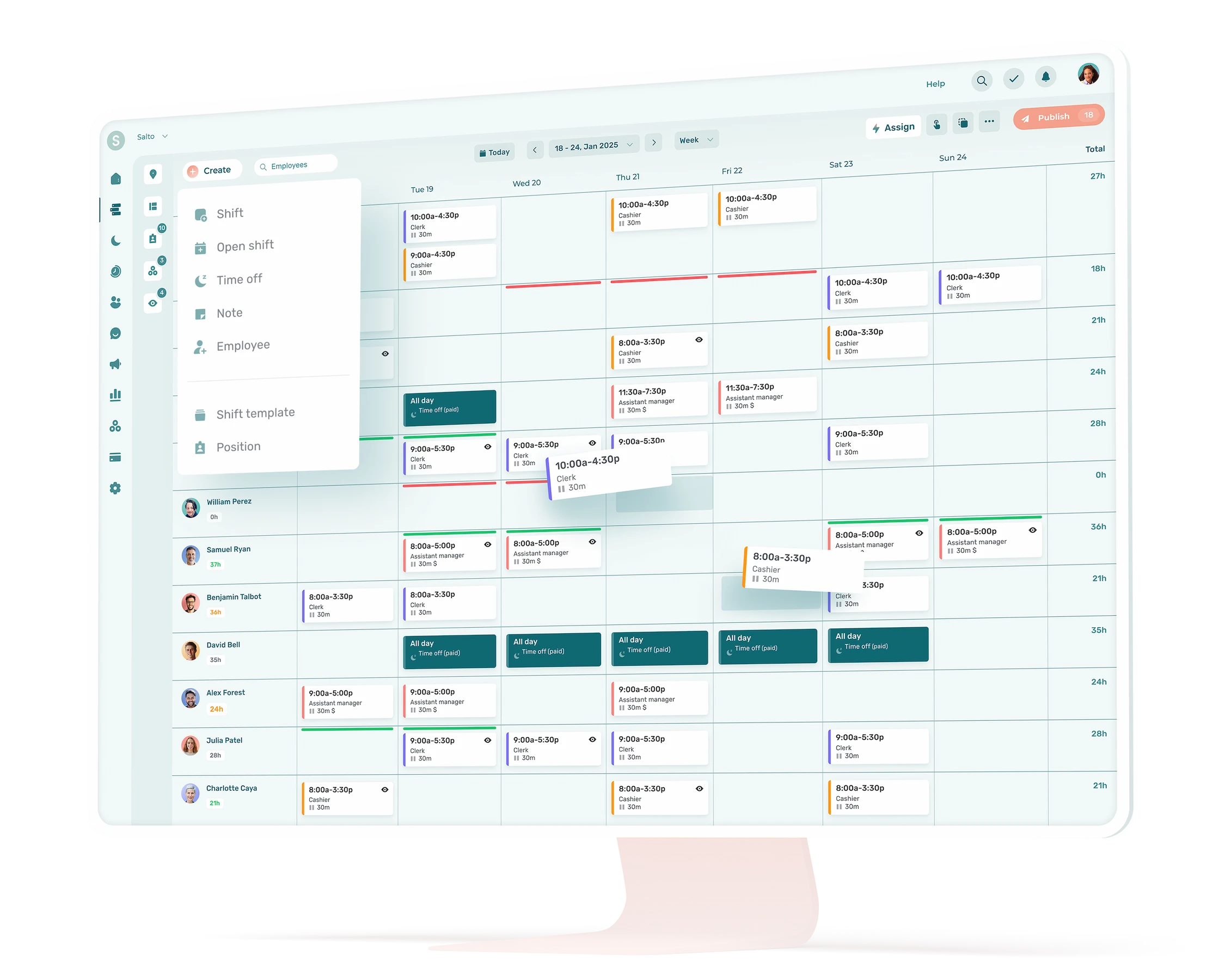
A “Create” Button to Centralize Key Features
Located in the upper left corner of the scheduler, the new Create button lets you quickly create new shifts, time offs, employees, and more.
Previously, each of these elements had its own, specific way of being managed. By consolidating them under a single button, our goal was to reduce the amount of back and forth between the different sections of Agendrix.
Side Panels to Better Segment Information
Most of the scheduler’s contextual windows have been replaced by side panels that better convey information and optimize your interactions. The schedule planner was the only major module where such panels had not yet been implemented. And it is now done.
Clearer Filters
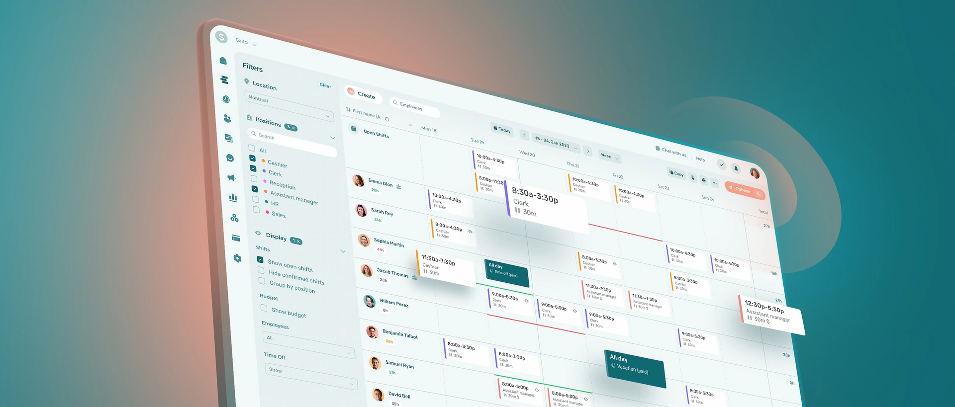
The way filters are organized on the left side of the planner has been reworked. In short, the individual filtering options have been segmented into several new logical subcategories. This means that you’ll have an easier time finding what you might be looking for in the scheduler.
Improved Scheduling Conflicts Management Tools
Scheduling conflicts are now shown directly in the scheduler rather than on the side. This should help to better contextualize any existing conflict and make navigating through them easier.
The Selection Mode, Revamped
The selection mode, which lets you select and edit several shifts simultaneously, has received some improvements. Notably, you’ll be able to access the mode’s different tools more easily and thus work more efficiently. A convenient search bar has also been added.
Smoother Drag and Drop
Our drag and drop function has been smoothed out. This means that you’ll be able to move and copy shifts with greater ease, even on a tablet.
An Interface That Better Adapts to Different Screen Size
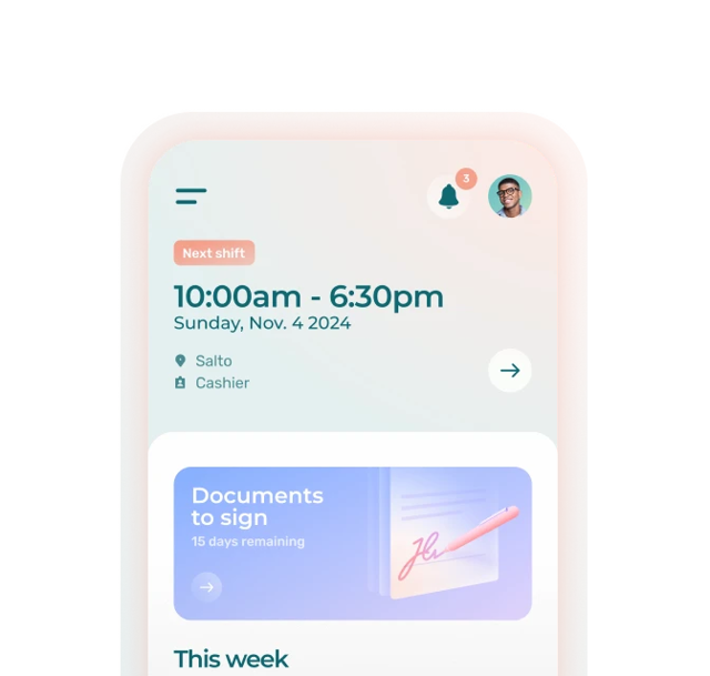
We took advantage of the makeover to rework the way the scheduler’s interface is resized when using smaller screens, including mobile screens.
Ready to Try It out?
To try the new scheduling interface, simply log in to Agendrix, where it will be enabled by default.
As needed, you’ll be able to switch between the old and the new version of the scheduler for the next few weeks. Remember that this is but a beta version of a major project. We invite you to send us your comments by chat or by email at [email protected].
Merry management!


